Jetpack Compose Buttons: Types, States, and Best Practices

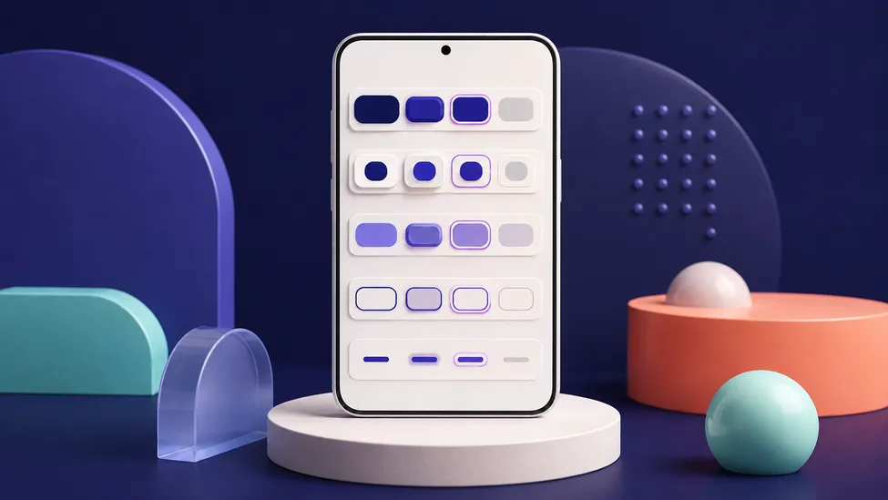
Quick answer: Use
Buttonfor the primary action,FilledTonalButtonorOutlinedButtonfor supporting actions, andTextButtonfor low-emphasis actions. UseElevatedButtononly when a shadow provides needed separation. Passenabledfrom UI state, let Material 3 supply theme-aware colors, and give every action a clear text or content description.
Material 3 provides five standard button composables: Button, ElevatedButton, FilledTonalButton, OutlinedButton, and TextButton. They share the same onClick, enabled, modifier, and content pattern, but their visual emphasis communicates which action deserves attention. The official Compose button guide documents the behavior and examples for each type.
Choose a button by emphasis
Do not choose a button only because its shape looks nice. First decide how important the action is in the current screen.
| Button | Emphasis | Good fit |
|---|---|---|
Button | High, filled | Save, Confirm, Join, or another action that completes a flow |
ElevatedButton | High, with a shadow | A high-emphasis action that needs separation from a patterned or busy surface |
FilledTonalButton | Medium, filled with a softer tone | A supporting action that still needs a visible container |
OutlinedButton | Medium, bordered | Secondary actions beside a filled primary action |
TextButton | Low, no border or fill | Dismiss, Cancel, or an action in a dense group |
The Material 3 API reference describes ElevatedButton as essentially a tonal button with a shadow and recommends using that separation only when it is necessary. If two actions have equal importance, do not make both filled buttons; the hierarchy becomes difficult to scan.
The shared Compose button shape
All five buttons accept a composable content lambda. Keep the action itself in onClick, pass UI state through enabled, and use the content slot for a short label.
import androidx.compose.material3.Button
import androidx.compose.material3.Text
import androidx.compose.runtime.Composable

@Composable
fun SaveButton(
    isSaving: Boolean,
    onSave: () -> Unit,
) {
    Button(
        onClick = onSave,
        enabled = !isSaving,
    ) {
        Text(if (isSaving) "Saving…" else "Save")
    }
}
The composable renders state and forwards the event. The ViewModel or screen state holder should decide when a save is in progress; the button should not start a network request or own application state. This follows the state-hoisting approach described in State Hoisting in Jetpack Compose.
See all five variants in one screen
This small example is useful in a component catalog or a design review. In a real screen, keep only the variants that match the action hierarchy.
import androidx.compose.foundation.layout.Column
import androidx.compose.foundation.layout.spacedBy
import androidx.compose.foundation.layout.fillMaxWidth
import androidx.compose.foundation.layout.padding
import androidx.compose.material3.Button
import androidx.compose.material3.ElevatedButton
import androidx.compose.material3.FilledTonalButton
import androidx.compose.material3.OutlinedButton
import androidx.compose.material3.Text
import androidx.compose.material3.TextButton
import androidx.compose.runtime.Composable
import androidx.compose.ui.Modifier
import androidx.compose.ui.unit.dp

@Composable
fun ButtonCatalog() {
    Column(
        modifier = Modifier.padding(24.dp),
        verticalArrangement = spacedBy(12.dp),
    ) {
        Button(onClick = { /* Save */ }, modifier = Modifier.fillMaxWidth()) {
            Text("Filled")
        }
        ElevatedButton(onClick = { /* Separate */ }, modifier = Modifier.fillMaxWidth()) {
            Text("Elevated")
        }
        FilledTonalButton(onClick = { /* Support */ }, modifier = Modifier.fillMaxWidth()) {
            Text("Filled tonal")
        }
        OutlinedButton(onClick = { /* Secondary */ }, modifier = Modifier.fillMaxWidth()) {
            Text("Outlined")
        }
        TextButton(onClick = { /* Dismiss */ }, modifier = Modifier.fillMaxWidth()) {
            Text("Text")
        }
    }
}
The spacedBy import above is available from androidx.compose.foundation.layout. Keep button widths and placement driven by the parent layout rather than putting screen-specific spacing inside a reusable button component.
Model enabled, loading, and destructive states
enabled = false prevents interaction and applies the component’s disabled colors. It is appropriate when an action cannot currently be performed—for example, while a save is in flight or when required input is missing.
@Composable
fun EditorActions(
    canSubmit: Boolean,
    isSubmitting: Boolean,
    onSubmit: () -> Unit,
    onCancel: () -> Unit,
) {
    androidx.compose.foundation.layout.Row(
        horizontalArrangement = spacedBy(12.dp),
    ) {
        OutlinedButton(
            onClick = onCancel,
            enabled = !isSubmitting,
        ) {
            Text("Cancel")
        }
        Button(
            onClick = onSubmit,
            enabled = canSubmit && !isSubmitting,
        ) {
            Text(if (isSubmitting) "Submitting…" else "Submit")
        }
    }
}
Use a semantic label such as Submitting… when it helps a user understand why the action is temporarily unavailable. For a destructive action, the label should name the consequence—Delete account, not simply Continue—and its confirmation flow should live outside the button.
For a user-controlled toggle such as “favorite,” use a toggleable control or IconToggleButton, not an ordinary button whose label changes without exposing state. Button state and one-time events are easier to reason about when they are explicit in the screen state.
Customize colors only for a real design reason
Material components already read MaterialTheme.colorScheme. Start with the defaults so light, dark, and dynamic palettes remain coherent. When a component needs a deliberate variant, use the matching ButtonDefaults factory rather than hard-coding colors.
import androidx.compose.material3.ButtonDefaults
import androidx.compose.material3.FilledTonalButton
import androidx.compose.material3.MaterialTheme

@Composable
fun ArchiveButton(onArchive: () -> Unit) {
    FilledTonalButton(
        onClick = onArchive,
        colors = ButtonDefaults.filledTonalButtonColors(
            containerColor = MaterialTheme.colorScheme.secondaryContainer,
            contentColor = MaterialTheme.colorScheme.onSecondaryContainer,
        ),
    ) {
        Text("Archive")
    }
}
Pair a container role with its matching on* role. This is especially important when your app supports dynamic color; a fixed foreground color that looked fine in one palette can become unreadable in another. The Dynamic Color and Dark Theme guide explains the static fallback and preview strategy.
Buttons with icons
Use an icon when it reinforces the label, not to replace a clear action name. Keep the icon decorative when the text already communicates the action:
Button(onClick = onDownload) {
    Icon(
        imageVector = Icons.Default.Download,
        contentDescription = null,
    )
    Spacer(Modifier.size(ButtonDefaults.IconSpacing))
    Text("Download")
}
This snippet assumes the Material icons dependency and imports for Icon, Icons, Spacer, and ButtonDefaults. A text label remains the accessible name. For a compact action with no label, use a labeled IconButton and provide a localized contentDescription; see Material Icons in Jetpack Compose for setup details.
Accessibility and touch targets
Material buttons provide built-in button semantics, so screen readers and Compose tests can treat the icon-plus-text content as one action. Keep the visible label specific and avoid putting a second clickable child inside a button. The Compose semantics documentation explains how this merged semantics tree works.
Interactive elements should have a reliable touch target. The Android accessibility guidance recommends at least 48dp for clickable elements; do not shrink a button’s layout below that target to fit more content. Check the result on a small device and at larger font scales, rather than judging only from a desktop preview.
Preview enabled and disabled variants
Preview the states users will actually encounter. Keep the sample deterministic by using your app theme and fixed state values.
import androidx.compose.runtime.Composable
import androidx.compose.ui.tooling.preview.Preview

@Preview(name = "Ready", showBackground = true)
@Composable
private fun SaveButtonPreview() {
    AppTheme {
        SaveButton(isSaving = false, onSave = {})
    }
}

@Preview(name = "Saving", showBackground = true)
@Composable
private fun SaveButtonSavingPreview() {
    AppTheme {
        SaveButton(isSaving = true, onSave = {})
    }
}
Add light and dark variants when your theme supports both, and test a real loading or validation state. The Compose Preview guide has more patterns for device sizes, font scales, and realistic sample data.
Test behavior through semantics
Buttons expose semantics that the Compose testing framework can find and interact with. Assert the important state and verify that the callback is called once:
import androidx.compose.ui.test.assertIsEnabled
import androidx.compose.ui.test.onNodeWithText
import androidx.compose.ui.test.performClick

var wasSaved = false
composeTestRule.setContent {
    SaveButton(isSaving = false, onSave = { wasSaved = true })
}

composeTestRule
    .onNodeWithText("Save")
    .assertIsEnabled()
    .performClick()

check(wasSaved)
Also test the disabled case with assertIsNotEnabled() and confirm that a click does not invoke the action. Prefer the visible label or a test tag that represents the public contract; avoid tests coupled to internal layout nodes.
Common mistakes
Making every action a filled button
When every action has maximum emphasis, none of them does. Reserve Button for the primary completion action and choose a lower-emphasis variant for alternatives.
Reimplementing disabled colors
Passing a hand-tuned alpha or gray color often breaks in dark and dynamic themes. Let ButtonDefaults calculate disabled colors unless a tested design requirement says otherwise.
Disabling a button without explaining why
If a form action is disabled, show the missing requirement near the relevant field. A disabled button alone does not tell users what to fix.
Owning application state inside the button
Do not use remember for a save-in-progress flag or launch work directly from a reusable button. Receive state and callbacks from the screen, while the ViewModel owns the operation.
FAQ
What is the difference between Button and FilledTonalButton?
Button is the high-emphasis filled option. FilledTonalButton uses a softer container and is a useful middle ground for supporting actions.
When should I use OutlinedButton instead of TextButton?
Use OutlinedButton when the secondary action needs a visible boundary. Use TextButton when the action should remain low-emphasis in a dense layout.
Is ElevatedButton always better than a filled button?
No. Its shadow is intended to separate an action from a visually busy or patterned surface. On a plain surface, a standard Button usually communicates the hierarchy more clearly.
How do I create an icon-only button?
Use IconButton or an appropriate Material 3 icon-toggle variant, and provide a localized contentDescription. A regular text button with an unlabeled icon is not a substitute for that semantics.
Next step
Once your actions have a clear hierarchy, the next building block is choosing the right container for the content around them. Keep the MaterialTheme guide nearby when you define button colors, typography, and shapes for that next screen.