How to Create a Custom Layout in Jetpack Compose

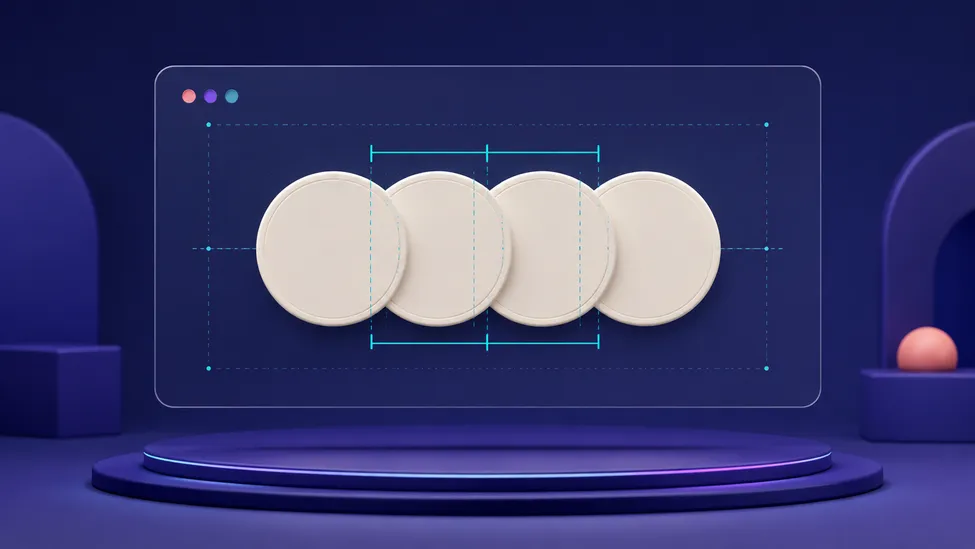
Quick answer: create a custom multi-child layout with
Layout { measurables, constraints -> ... }. Measure each child once, calculate a size that stays within the parent’s constraints, then place each resultingPlaceable. UseModifier.layoutinstead when you only need to change how one existing child is measured or positioned.
Row, Column, Box, and the standard modifiers should be your first choice. They are readable, familiar, and cover most UI relationships. A custom layout earns its complexity when the relationship between several direct children is unique: overlapping avatars, a tag cloud with a special packing rule, a chart annotation layer, or a timeline whose labels follow data points.
This guide builds an overlapping-avatar layout, then turns the example into a dependable mental model for custom Compose measurement.
When do you need a custom layout?
Start with the least specialized option that expresses the design:
| Need | Prefer | Why |
|---|---|---|
| Children in a normal horizontal, vertical, or layered relationship | Row, Column, or Box | The intent is already modeled by a standard layout. |
| One child needs custom size or placement behavior | Modifier.layout | It changes the wrapped element without creating a new multi-child parent. |
| Multiple direct children need a new measurement or placement rule | Layout | You control how the parent measures and arranges those children. |
| A child must be composed only after another child is measured | A specialized subcomposition API | This is an advanced case with a performance cost; do not reach for it just to build a normal custom layout. |
For example, an avatar group cannot be expressed as a plain Row plus negative padding without making its width, hit areas, and clipping rules hard to reason about. The group has one meaningful rule: each following avatar starts before the previous avatar ends. That is a good fit for Layout.
If the design is simply “text beside an icon” or “a badge above an image,” keep the standard containers. Row vs Column vs Box covers those core relationships, and Arrangement and Alignment covers their built-in spacing controls.
The custom layout contract: measure, size, place
During Compose’s layout phase, a parent receives constraints, measures its direct children, chooses its own size, and places those children. The official custom layouts guide makes one rule especially important: a layout must not measure the same child more than once in a normal measurement pass.
In a Layout measure block, you receive:
measurables: the direct child nodes emitted by thecontentlambda.constraints: the minimum and maximum width and height offered by the parent, in pixels.- a
MeasureScope, which provideslayout(width, height) { ... }and density-aware helpers such asDp.roundToPx().
Calling measurable.measure(...) returns a Placeable: the child’s resolved width, height, alignment lines, and placement functions. After every child is measured, call layout(...) with the parent’s final size and place the children in that lambda.
The values in Constraints are not the physical screen size. They are the bounds the immediate parent supplied. Read Constraints in Jetpack Compose first if that distinction is unfamiliar.
Build an overlapping avatar group with Layout
The following composable measures each avatar with the parent’s maximum bounds but removes incoming minimums. That lets each child use its natural size instead of being forced to the parent’s minimum width or height.
import androidx.compose.runtime.Composable
import androidx.compose.ui.Modifier
import androidx.compose.ui.layout.Layout
import androidx.compose.ui.unit.Dp
import androidx.compose.ui.unit.dp

@Composable
fun OverlappingAvatarRow(
    modifier: Modifier = Modifier,
    overlap: Dp = 16.dp,
    content: @Composable () -> Unit,
) {
    Layout(
        modifier = modifier,
        content = content,
    ) { measurables, constraints ->
        // Let each avatar choose its own size within the parent's maximum bounds.
        val childConstraints = constraints.copy(
            minWidth = 0,
            minHeight = 0,
        )
        val placeables = measurables.map { measurable ->
            measurable.measure(childConstraints)
        }

        val overlapPx = overlap.roundToPx().coerceAtLeast(0)
        val naturalWidth = placeables.foldIndexed(0) { index, width, placeable ->
            width + if (index == placeables.lastIndex) {
                placeable.width
            } else {
                (placeable.width - overlapPx).coerceAtLeast(0)
            }
        }
        val naturalHeight = placeables.maxOfOrNull { it.height } ?: 0

        val layoutWidth = constraints.constrainWidth(naturalWidth)
        val layoutHeight = constraints.constrainHeight(naturalHeight)

        layout(layoutWidth, layoutHeight) {
            var x = 0
            placeables.forEach { placeable ->
                placeable.placeRelative(x = x, y = 0)
                x += (placeable.width - overlapPx).coerceAtLeast(0)
            }
        }
    }
}
Use it with direct children. The order matters because later children are placed after earlier ones and draw above them:
import androidx.compose.foundation.background
import androidx.compose.foundation.layout.Box
import androidx.compose.foundation.layout.size
import androidx.compose.foundation.shape.CircleShape
import androidx.compose.ui.draw.clip
import androidx.compose.ui.graphics.Color
import androidx.compose.ui.unit.dp

OverlappingAvatarRow(overlap = 14.dp) {
    listOf(Color(0xFF6750A4), Color(0xFF006C67), Color(0xFFB3261E)).forEach { color ->
        Box(
            modifier = Modifier
                .size(48.dp)
                .clip(CircleShape)
                .background(color),
        )
    }
}
In a production avatar component, use images with meaningful content descriptions when they convey who is present. If surrounding text already names the people and the avatars are only decorative, a null content description can be appropriate.
Why the example handles constraints this way
The line below is the layout’s safety boundary:
val layoutWidth = constraints.constrainWidth(naturalWidth)The natural width is what the avatar sequence would like to occupy. constrainWidth converts that into a width allowed by the parent, including any finite maximum and minimum. constrainHeight does the equivalent for height.
That does not automatically make an oversized child sequence scroll, shrink, or clip. Those are separate design decisions. This example continues placing later avatars, so a narrow parent can allow them to extend past its bounds unless an ancestor clips them. Choose intentionally:
- Limit the number of visible avatars and add a “+N” indicator.
- Make the surrounding content horizontally scrollable when that interaction makes sense.
- Scale or crop the avatar treatment only if it remains usable.
Avoid treating constraints.maxWidth as a number you can always fill. It can be unbounded in some layouts, and a custom layout still has to produce a sensible result in its parent’s context. The constraints and modifier order guide explains how those bounds move through the UI tree.
What each measurement line does
The measure policy has a strict order:
measurable.measure(childConstraints)asks each direct child for a size exactly once.naturalWidthandnaturalHeightderive the parent’s preferred content size from thosePlaceableresults.constraints.constrainWidthandconstraints.constrainHeightkeep the parent’s reported size valid.layout(...)opens the placement scope.placeRelative(...)assigns each child a position.
Use placeRelative for ordinary horizontal positions so Compose mirrors start/end placement in right-to-left layouts. Use place(x, y) only when the x coordinate is intentionally physical and should not mirror. This small choice prevents custom layout code from quietly becoming left-to-right only.
The Compose UI phases guide gives the surrounding picture: measurement and placement are layout work, after composition decides which children exist and before drawing renders them.
Use Modifier.layout for one child
Layout is a parent for several direct children. If the component has one child and only needs an unusual measurement or placement rule, use the layout modifier instead.
Here is a small modifier that adds extra space above a child without changing its width:
import androidx.compose.ui.Modifier
import androidx.compose.ui.layout.layout
import androidx.compose.ui.unit.Dp
import androidx.compose.ui.unit.offset

fun Modifier.extraTopSpace(space: Dp): Modifier = layout { measurable, constraints ->
    val spacePx = space.roundToPx().coerceAtLeast(0)
    val childConstraints = constraints.offset(vertical = -spacePx)
    val placeable = measurable.measure(childConstraints)

    val width = constraints.constrainWidth(placeable.width)
    val height = constraints.constrainHeight(placeable.height + spacePx)

    layout(width, height) {
        placeable.placeRelative(x = 0, y = spacePx)
    }
}
This is the convenience API for creating a LayoutModifier; the API reference documents its single Measurable contract. The modifier is a good fit when it changes the behavior of the element it wraps. Do not use it to coordinate several siblings: the modifier cannot directly measure or place them.
Common mistakes in custom Compose layouts
Measuring a child twice
Do not measure a direct child with one set of constraints, inspect the result, and measure it again with another set. Compose detects this and throws at runtime. If the design genuinely needs information before normal measurement, investigate intrinsic measurements; if one child must be composed based on another child’s size, evaluate subcomposition carefully. Both are specialized tools, not a workaround for an unclear measure policy.
Reporting a size outside the parent’s bounds
Returning layout(naturalWidth, naturalHeight) directly works only when those values already obey the parent’s constraints. Use constraints.constrainWidth and constraints.constrainHeight, especially when child content can vary because of localization, font scale, or user-provided data.
Forgetting that only direct children are measured
Layout sees nodes emitted directly by its content lambda. If the lambda emits one Column containing five items, the custom layout measures one Column, not five separate items. This is usually correct; add another layout level only when you truly need control over those individual descendants.
Hard-coding left-to-right positions
Use placeRelative for logical start-based positioning. Test the component with an RTL locale as well as long localized names and large font sizes.
Reimplementing a standard layout
Hand-writing a Column teaches the API, but usually creates more maintenance work than it saves. Prefer standard layouts for standard relationships, and keep a custom measure policy focused on the unique rule it owns.
Test a custom layout at its boundaries
Custom layout bugs often hide until real content arrives. Add previews and UI tests that cover:
- zero, one, and many children;
- children with unequal sizes;
- the narrowest parent your screen allows;
- large font scale, localized text, and RTL placement where the component contains text;
- touch targets when children overlap;
- clipping, scrolling, or a visible-count rule when the natural size exceeds the parent.
Previewing the custom composable with a fixed narrow Modifier.width(...) and a wider one is a quick way to see whether your overflow decision matches the design. For a component whose layout changes with available space, BoxWithConstraints can choose between compositions; it does not replace the measurement and placement logic inside a genuinely custom multi-child layout.
A reliable rule of thumb
Reach for Layout when your component needs a new, reusable rule for measuring and arranging multiple direct children. Write that rule in the same order Compose uses: measure each child once, derive a constrained parent size, then place the children. If only a single element changes, start with Modifier.layout; if a standard relationship is enough, keep Row, Column, or Box.
That boundary keeps custom layouts small, testable, layout-direction aware, and much easier to revisit when the design changes.